The Challenge
Go beyond the limits of existing Business Intelligence (BI) tools and find an easily readable representation to make the most important numbers accessible to every education layer.
The Outcome
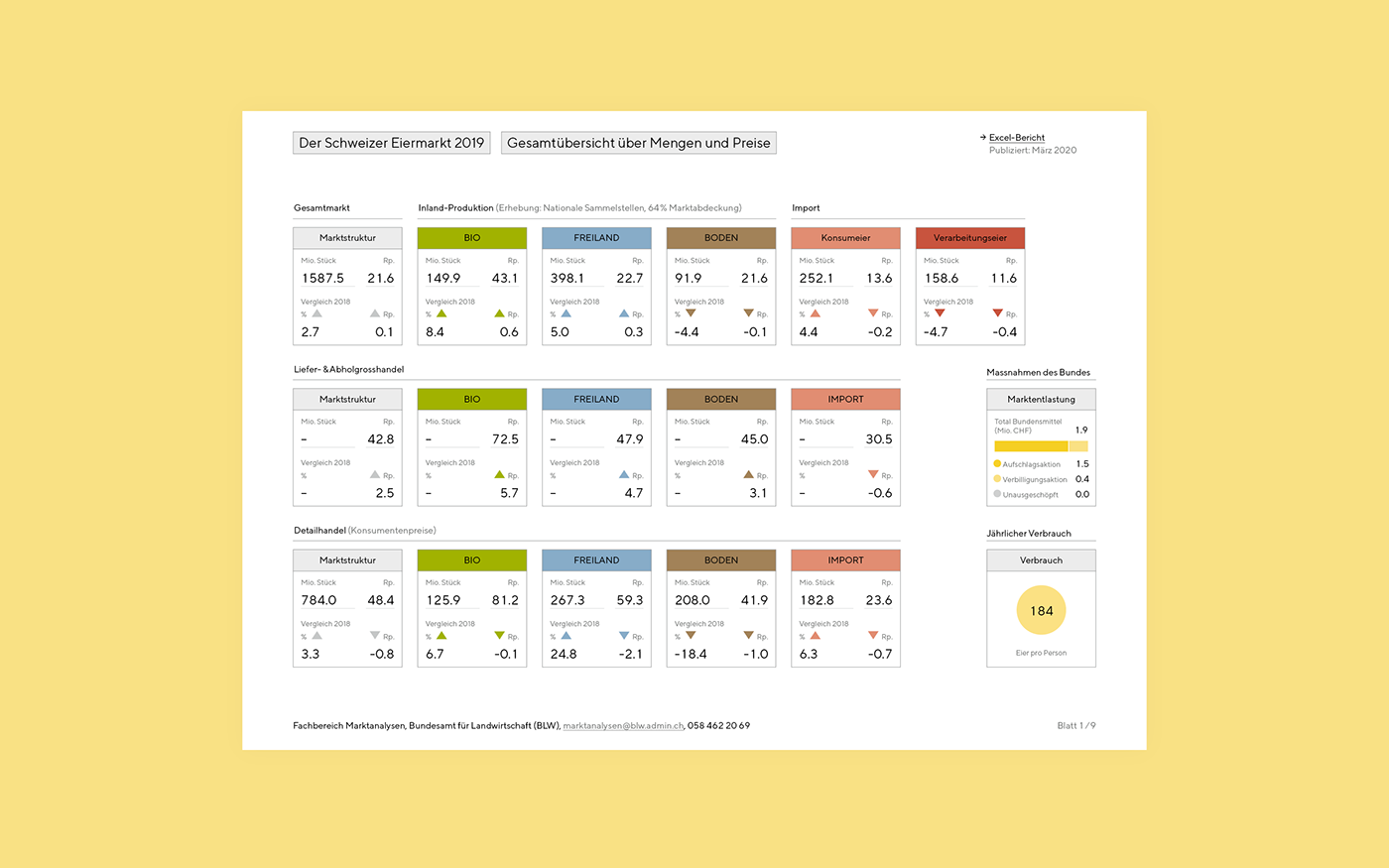
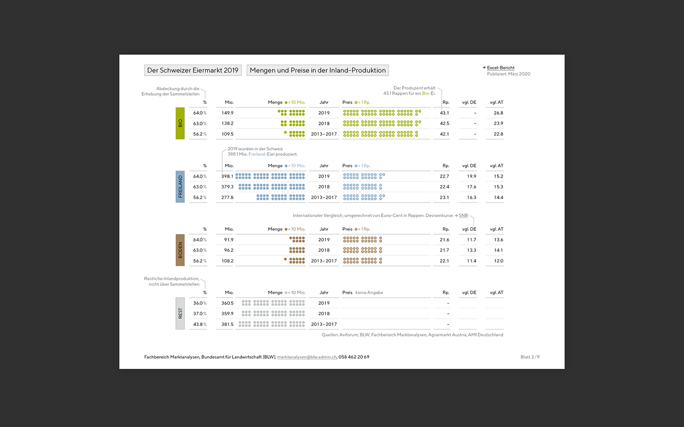
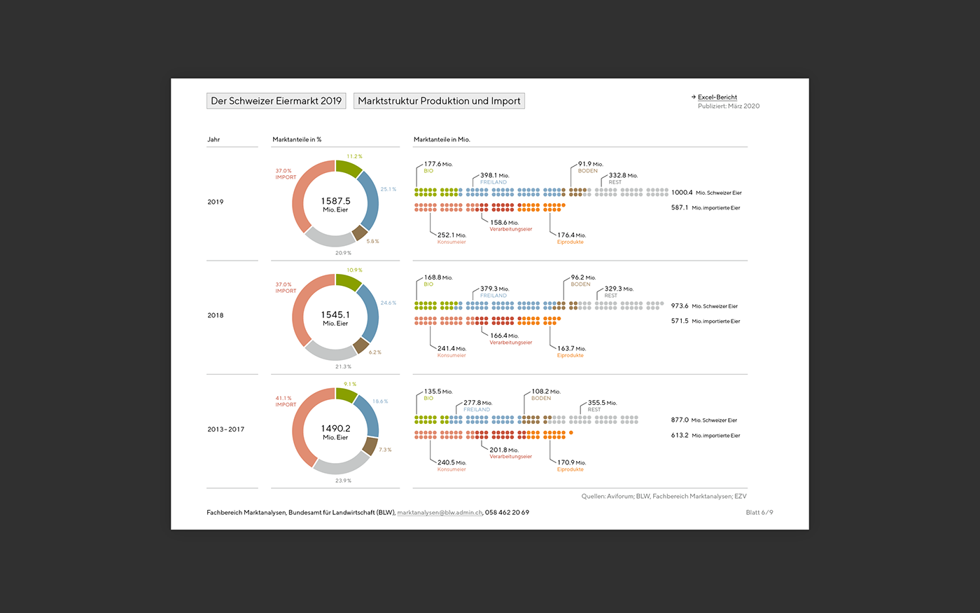
A countable diagram language combined with the strict and systematic use of color results in an easy to read report. The legends and comments placed directly in the chart loosen up the collection of numbers more into a story. A central element are the numbers organized in tiles on the entry pages of every chapter.
A countable diagram language combined with the strict and systematic use of color results in an easy to read report. The legends and comments placed directly in the chart loosen up the collection of numbers more into a story. A central element are the numbers organized in tiles on the entry pages of every chapter.
The Impact
The unattractive tool character of BI tools is replaced by a simple diagram principle and a tile-like overview of the most important Key Performance Indicators (KPI). The dashboard pages, which function as PPT slides, but also as printouts, live primarily from the simplicity of having already been curated in terms of content.